ACCESS FOR DIVERSE COMMUNITIES
In expanding to work with Indigenous communities in remote and rural Western Australia, the Ethnic Disability Advocacy Centre recognized that it had to change the way it positioned itself, as they were no longer “just” focused on culturally and linguistically diverse clients from years past. A new mandate for their work required a new brand purpose to ground their work with.
As an organization that has existed for decades, EDAC highlighted how important it was for us to consider the trust they have built with clients from ethnic backgrounds, but also the goal of telling their stories more inclusively for all stakeholders.
This involved a need to rename EDAC into something simpler and easier to remember for clients—forgoing the acronym and rethinking the term “ethnic” in its name.
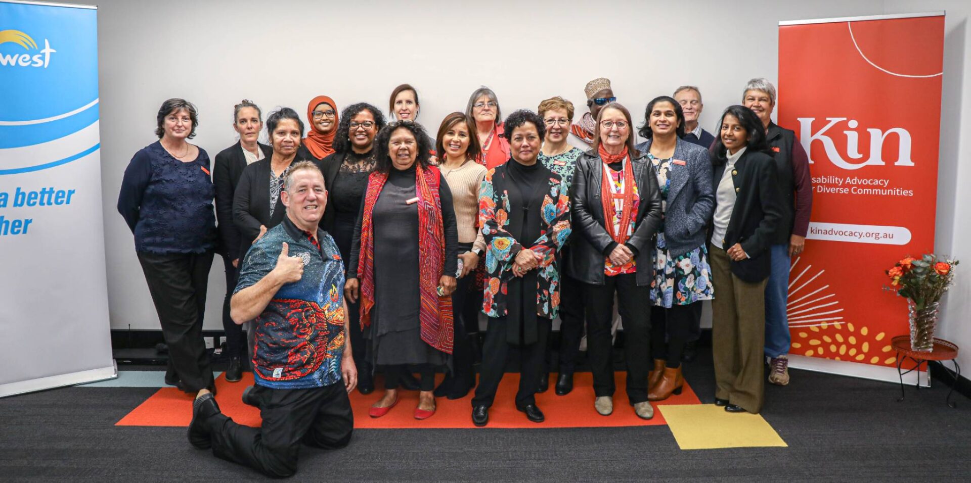
Recognizing how important EDAC’s community would be to its rebrand, we booked multiple discovery workshops after project kickoff to co-design much of the brand’s strategy and positioning. This included completing additional consultations with wider stakeholder groups: referring agencies, clients who had become board members, funding bodies, volunteer advocates, and family and friends who were often carers of clients.
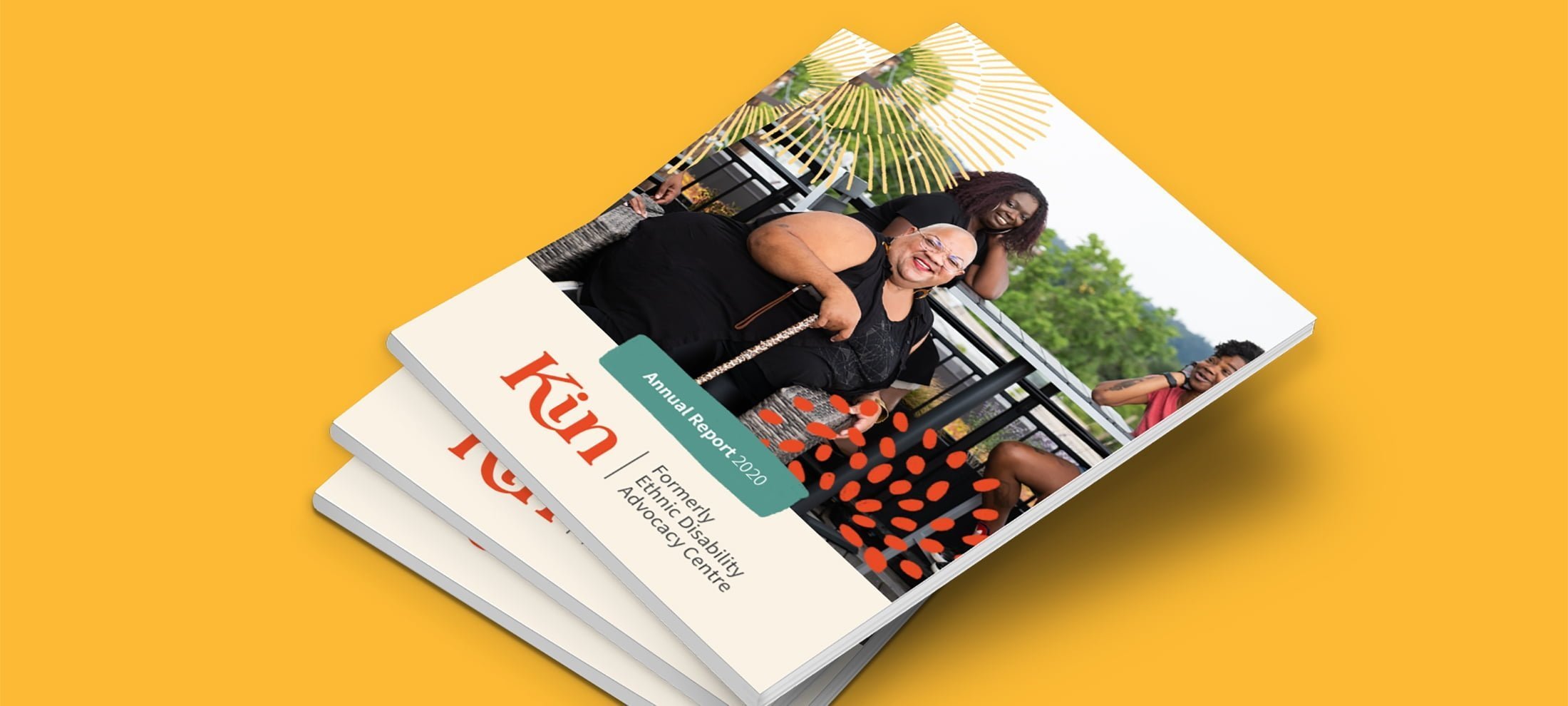
Insights from this process then cascaded into a brand naming process, comprehensive brand strategy, consumer-facing brand tagline and messaging, full identity design, and publications roll-out.
Undertaking a naming process
Kin’s decade-long history with its former name (with all of the positive sentiments it brought for clients) meant that we had to thoughtfully design a series of naming workshops that would nurture buy-in with their community.
KIN AS STEADFAST ADVISORS
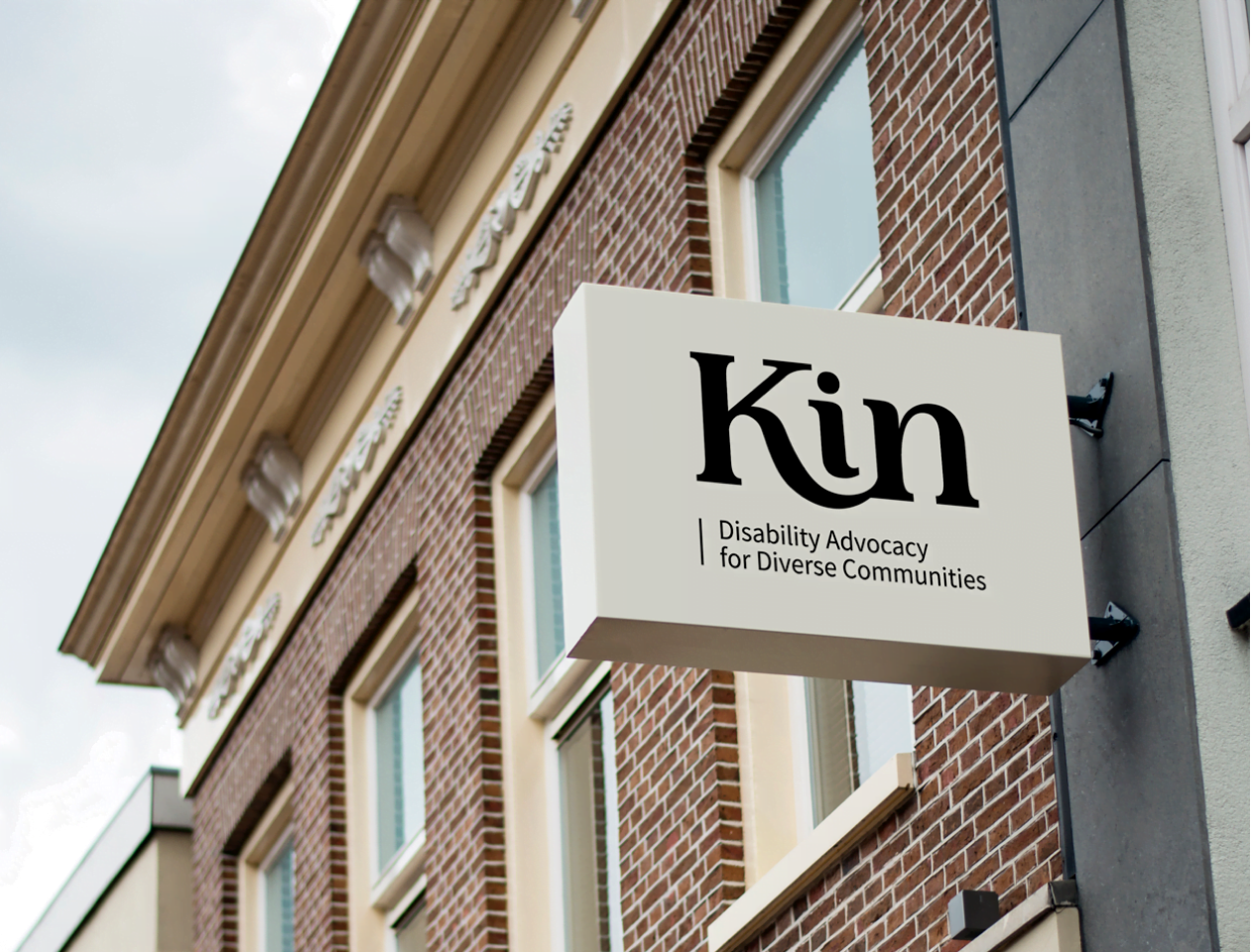
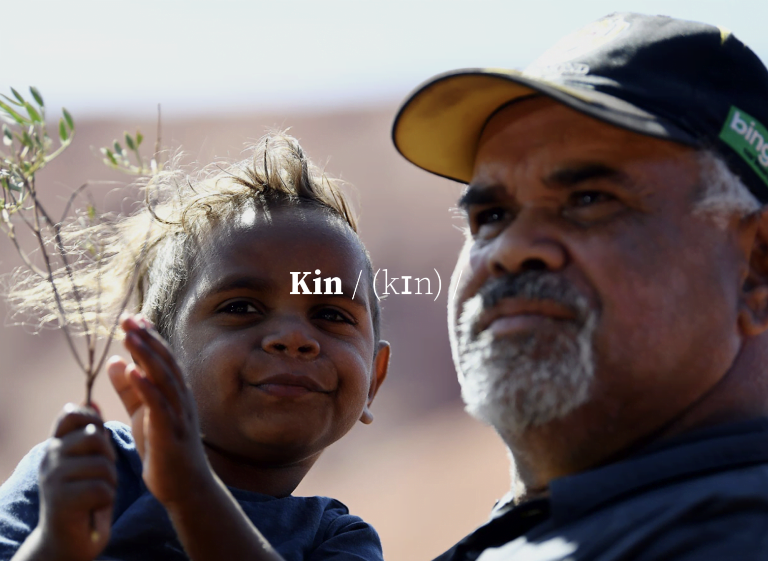
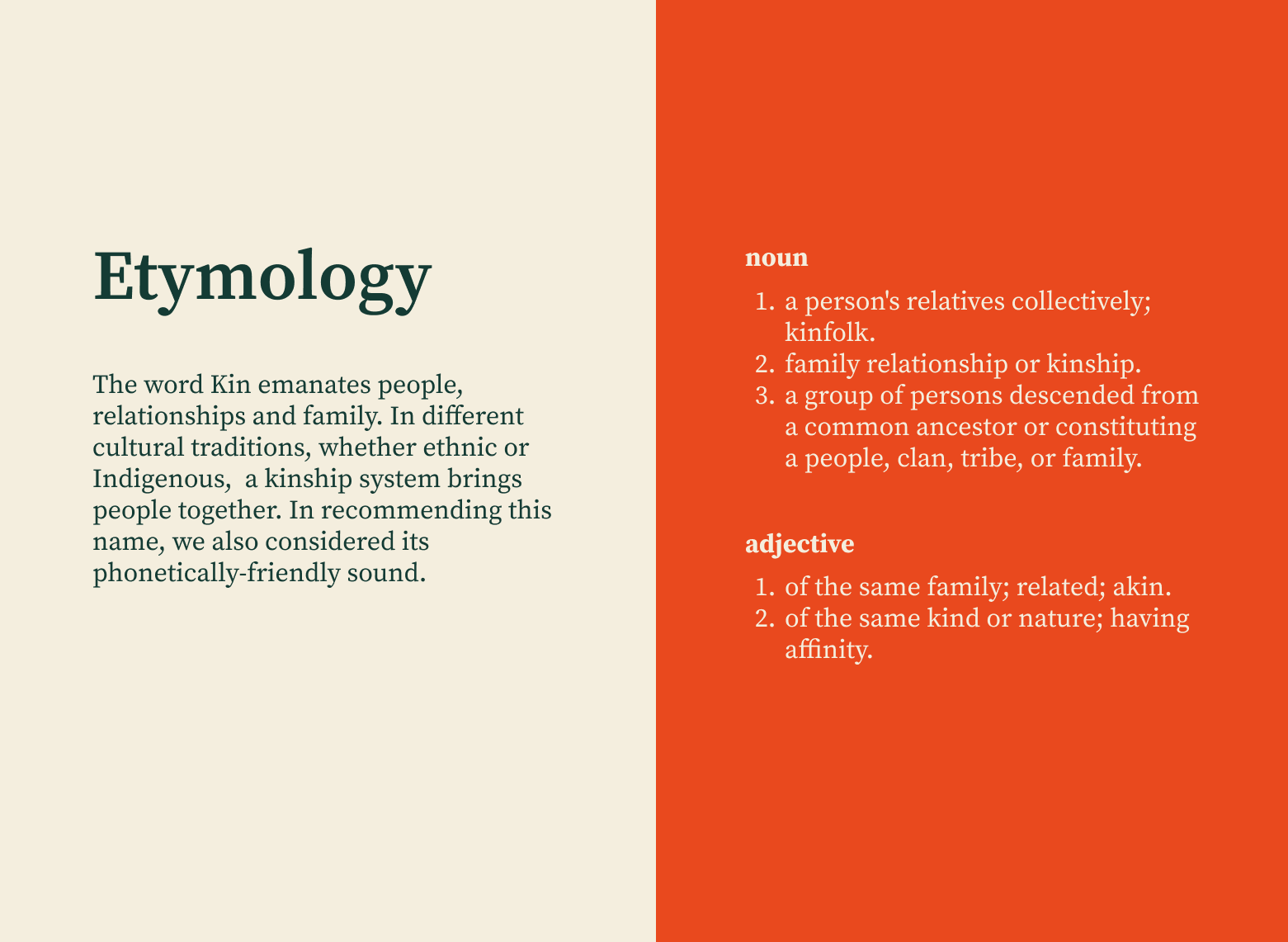
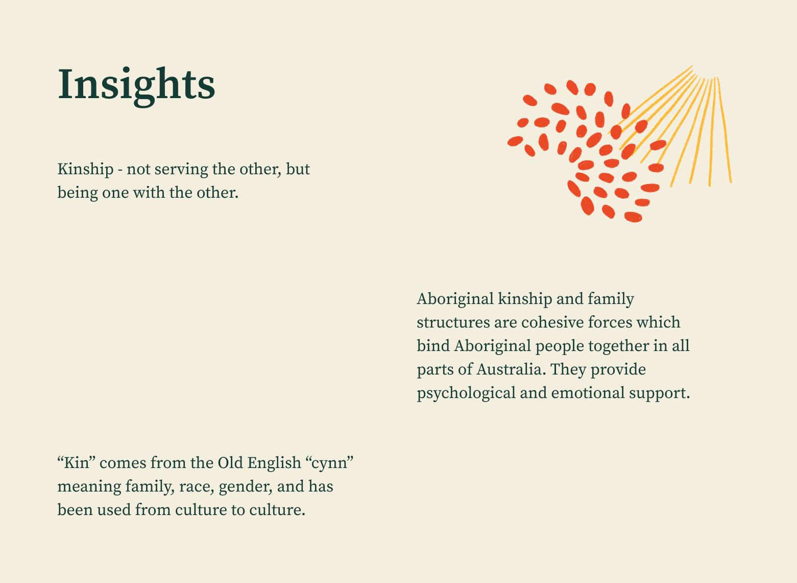
Through a rigorous consultative brand process spanning months with more than 25+ one-on-one and group interviews, EDAC has since launched its rebrand as Kin Advocacy — a word with etymology rooted in people, community and whose concept of kinship has relevance in Indigenous family structures. Most importantly, this new name was not only more representative of who Kin is for today, but continues to be a name with easy recall phonetically. This was a critical consideration where English is often a second language for Kin’s clients and staff.
To intentionally build public equity for Kin’s new brand, it was important that we kept our new values and tone of voice in mind when writing messaging and designing the identity. Positioned as a steadfast advisor, Kin’s language is nuanced, respectful and confident. Similarly, Kin’s role as fierce protectors of the rights of people with disability meant using simple, everyday language to build inclusivity in how it communicates with their clients.
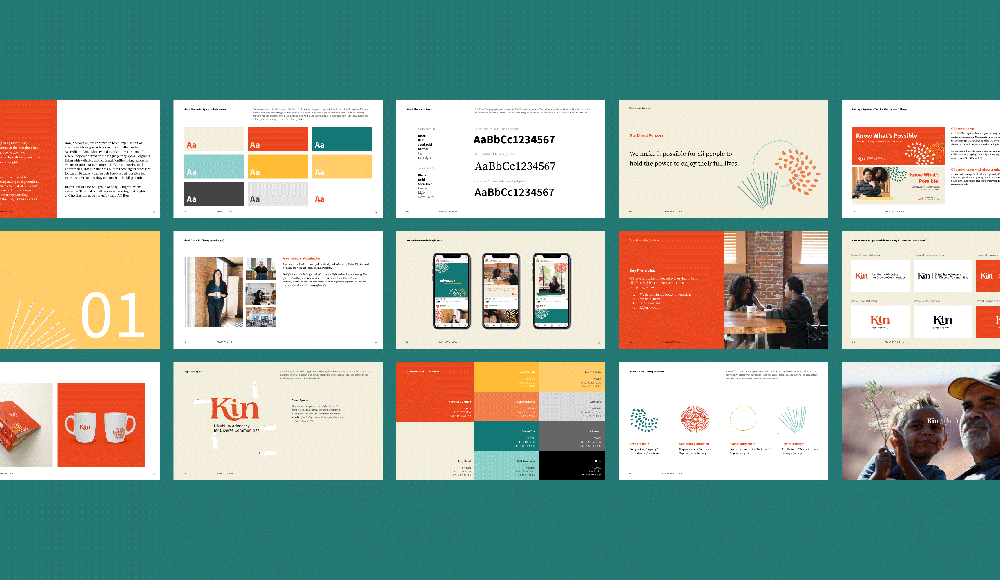
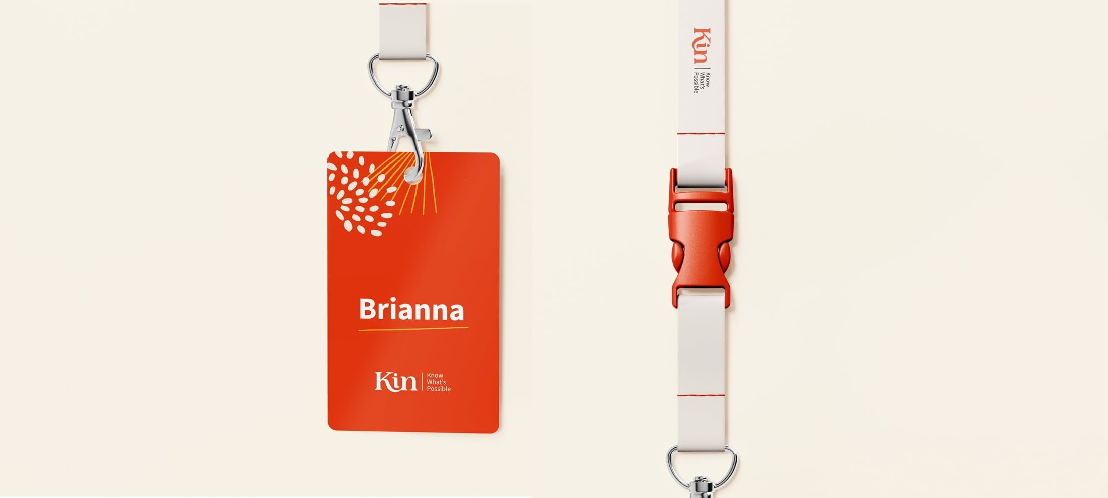
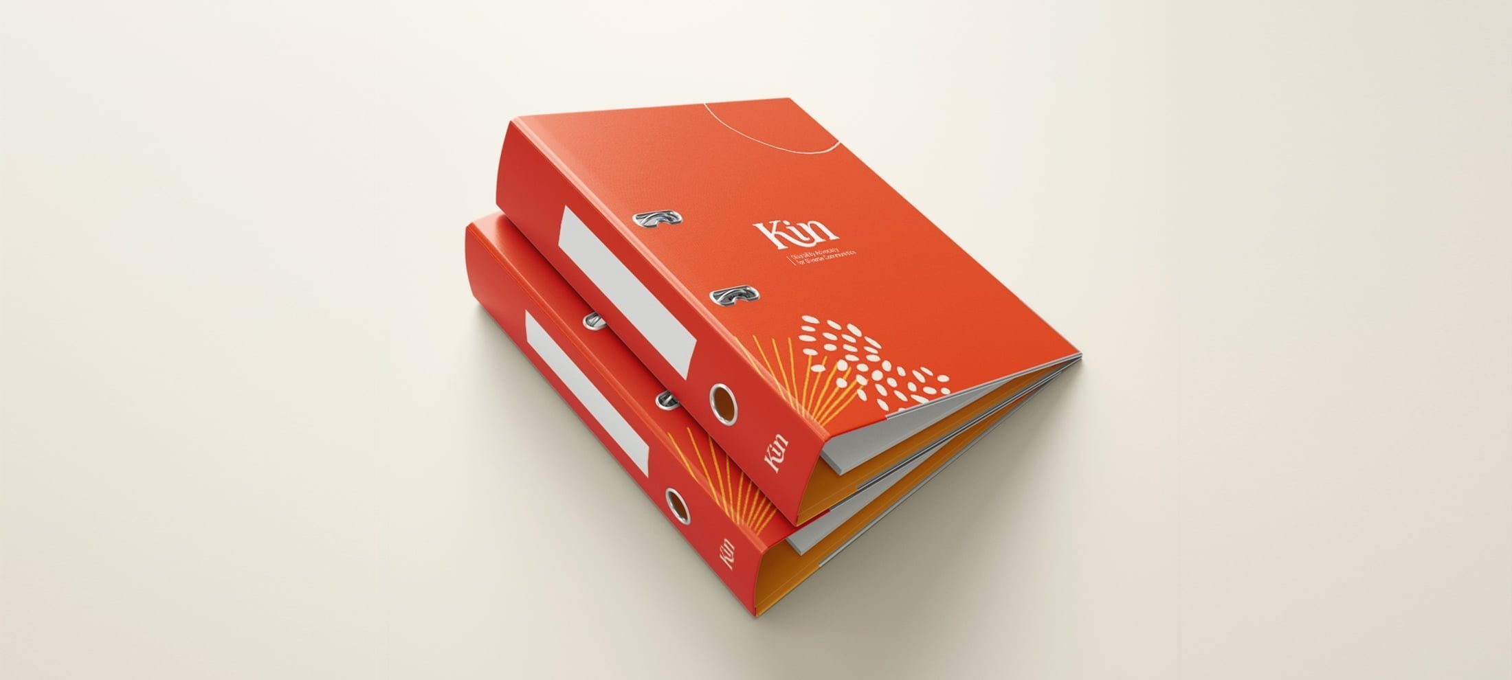
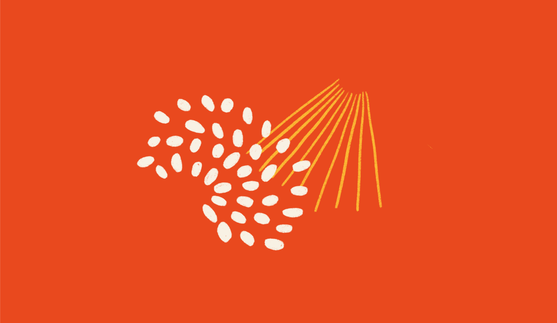
We developed Kin’s entire design system based on these principles, balancing the tension of the team’s astute expertise with its heart to work in their client’s best interest. While colours did much of the lifting (with warm and active oranges working with cooler teals), the identity revolved around brand devices that contained textures of what has inspired Kin over their two decades—seeds of hope, rays of strength, and shapes that represent a close-knit community. These devices were designed to be “mixed and matched” to share a sense of play for Kin’s team when creating materials.
Since launching, Kin has worked with Media on Mars, a digital agency we work with, to design their new, fully-accessible website. Built with their new brand, Kin’s website won Website of the Year at the Australian Access Awards for accessibility.

Project credits
Jeffrey Effendi
Angel Chen
Abigail Coldrey
Morgane Guedj
“DrawHistory played a significant role in working alongside key stakeholders to develop a shared vision, understanding, and purpose for our new name and story. We’re so glad to have collaborated with them on a project so meaningful and important to us.”

